Overview
This document details the guidelines and standards adhered to by the Creative Technology department at TMW, and all web applications built should take these into consideration. It is an evolving document and should be reviewed as and when required to keep up with changes in technology and best practice.
These guidelines have been compiled looking at various previously written guidelines - credit goes to Isobar and CSS Wizardry both of which have been used as foundations to build upon for this document, and in some sections been directly quoted.
Contents
- General Guidelines
- Browser Support
- Base Templates and frameworks
- Markup
- CSS
- JavaScript
- Accessibility
- Performance and Optimisation
General Guidelines
- All front-end code should display clear separation of presentation, content, and behaviour.
- Markup should be well formed, semantically correct and generally valid.
- JavaScript should progressively enhance the experience
- Use feature detection rather than browser sniffing (edge cases such as performance are acceptable)
- Gracefully degrade functionality when not present (e.g GPS, box-shadow, forms etc).
Indentation
For all languages, indent your code with tabs. The default tab size should be set as 4.
Readability vs Compression
We encourage readability over file-size when it comes to maintaining existing files. Plenty of white-space is encouraged, along with ASCII art, where appropriate. There is no need for any developer to purposefully compress HTML or CSS, nor obfuscate JavaScript.
We will use server-side or build processes to automatically minify and gzip all static client-side files, such as CSS and JavaScript.
Browser Support
- Internet Explorer 7+
- Firefox 3.6+
- Google Chrome
- Safari 5
- Opera
Base Templates and frameworks
We use Kickoff, a lightweight front-end framework we have put together for creating scalable, responsive sites.
When building static templates, we use Kickoff Statix, which integrates Kickoff with Assemble to make templating faster and more maintainable.
Both Kickoff and Kickoff Statix are actively maintained by the Creative Tech team at TMW; for more information about their features, getting started and demos, see the Kickoff documentation site.
Markup
HTML5
The HTML5 Doctype and HTML5 features will be used on projects when appropriate.
To ensure HTML5 markup compatibility with older browsers, use either:
- Modernizr - consider bloat, use the build generator to decrease its size
- HTML5shiv - no feature detection, simply ensures markup compatibility
We will test our markup against the W3C validator, to ensure that the markup is well formed. 100% valid code is not a goal, but validation certainly helps to write more maintainable sites as well as debugging code. TMW does not guarantee markup is 100% valid, but instead assures the cross-browser experience is consistent.
General Markup Guidelines
The following are general guidelines for structuring your HTML markup. Authors are reminded to always use markup which represents the semantics of the content in the document being created.
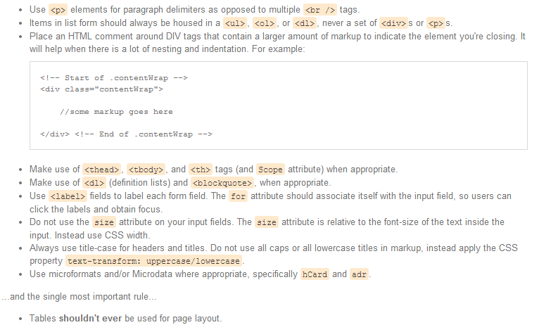
Quoting Attributes
While the HTML5 specification defines quotes around attributes as optional for consistency with attributes that accept whitespace, all attributes should be quoted.


Character Encoding
All markup should be delivered as UTF-8, as it's the most friendly for internationalization. It should be designated in both the HTTP header and the head of the document.
Set the character set using

Accessibility
Consider ARIA integration for high accessibility sites.
For our full guidelines on Accessibility, refer to the Accessibility Guidelines section of this document.
CSS
General CSS Principles
- Every time you write inline styles in your markup, a front-end developer somewhere dies - whether it's in a style tag or directly in the markup. Don't do it.
- Add CSS through external files, minimizing the number of files, if possible. CSS should always be included in the
of the document. - Use the
tag to include, never@import. - Ensure markup and style stays separate (some style classes are allowed, e.g imageReplace etc). Only use style only markup if you absolutely have to (e.g extra wrapping elements); consider
:beforeand:afterCSS pseudo-elements if styles are not 100% necessary.
Syntax and formatting
- Use multi-line CSS declarations. This helps with version control (diff-ing single line CSS can be a nightmare). Group CSS declarations by type - keeping font related styling together, layout styling together etc - and ordered by relevance, not alphabetized.
- All CSS rules should have a space after the selector colon and a trailing semi-colon.
- Selectors should be specified using a simplified version of BEM
- INSERT RULES HERE.
- Use shorthand when specifying multiple values. Remember longhand can be shorter for single values.
- Multi-attribute selectors should go on separate lines.
- Don't over qualify class or ID selectors. Leads to specificity issues further down the line.
// Bad div.content {} // Good .content {} - 0 requires no units
// Good
.bar,
.foo[href="bar"] {
    position: absolute;
    top: 0;
    right: 0;
    bottom: 0;
    left: 0;

    padding: 10px 0 0 0;
    margin: 10px 0;

    background: red;
    border-radius: 10px;
    -moz-border-radius: 10px;
}
Indenting
For each level of markup nesting, indent your CSS to match. For example:
 nav {}
        nav li {}
            nav li a {}

    .content {}
        .content p {}
OOCSS
When building components try and keep a DRY, OO frame of mind.
Instead of building dozens of unique components, try and spot repeated design patterns and abstract them; build these skeletons as base 'objects' and then peg classes onto these to extend their styling for more unique circumstances.
If you have to build a new component split it into structure and skin; build the structure of the component using very generic classes so that we can reuse that construct and then use more specific classes to skin it up and add design treatments.
Read: - The Nav Abstraction
Typography
@font-face should be used for font replacement where possible - ensuring that the font can be safely used in .ttf format on the web in agreement with its licensing agreement. Where this is an issue, look to use tools such as TypeKit or Fontdeck
To generate @font-face files, the Font Squirrel font-face generator should be used.
JavaScript replacement techniques should be avoided where possible, as they are painful, time-consuming and usually inaccurate. Flash replacement techniques (such as Sifr) should never be used.
Always define supporting font-size classes, in conjunction with headers to avoid restyling header sizes.
Reset vs Normalisation
There is no set preference to using a reset CSS file or using a normalisation technique, as long as consistency is applied throughout projects.
If a reset is preferred, the Eric Meyer reloaded reset should be used.
For normalisation, the excellent normalise.css should be included.
Kickoff, which is used as a base for all of TMW‘s projects, chooses to implement normalisation by default, rather than a CSS reset.
Comments
Comment as much as you can as often as you can. Where it might be useful, include a commented out piece of markup which can help put the current CSS into context.
CSS will be minified before it hits live servers, so don't worry about excessive commenting bloating code - the benefits far outweigh any file-size worries.
This is especially true for responsive layouts where percentage width/margin's have been worked out. Always comment in the ratio so that the resulting % values mean something to the next developer viewing your CSS. A random 6dp percentage will mean nothing to anyone else looking at your code.
e.g.
width: 34.042553% /* 320 / 940 */Specificity, IDs and classes
CSS is designed to cascade, so make sure you understand cascading and selector specificity. It will enable you to write very terse and effective code.
Use of IDs and classes effect specificity massively. Only use IDs where deemed necessary, especially on larger builds. Classes are much more modular and portable. If you want to use an ID solely as a JavaScript hook, consider using the ID alongside a class for CSS styling.
Name classes and IDs by the nature of what it is rather than what it looks like. A class of blueBox-left may seem relevant at the time, but should its colour or position change, it will become meaningless. Naming in conjunction with a more OOCSS approach should eliminate this ambiguity.
Conditional Stylesheets
Stylesheets specific for Internet Explorer can, by and large, be totally avoided. The only time an IE stylesheet may be required is to circumvent blatant lack of support (e.g. media queries, PNG fixes).
As a general rule, all layout and box-model rules can and will work without an IE stylesheet if you refactor and rework your CSS. This means we never want to see
When building mobile first responsive websites, it is necessary to generate a separate stylesheet for old versions of IE to ensure they aren't left with the mobile version of your website because they cannot read media queries. This can be done using SASS and is covered in the SASS – IE Stylesheet section of this documentation.
If IE specific styling is required, look to utilise Paul Irish's body/html class conditional for IE* targeting.
!important
It is okay to use
!important on helper classes only. To add !important pre-emptively is fine, e.g. .error { color:red!important }, as you know you will always want this rule to take precedence.
Using
!important reactively, e.g. to get yourself out of nasty specificity situations, is not advised. Rework your CSS and try to combat these issues by refactoring your selectors. Keeping selectors short and avoiding IDs will help you out here massively.Magic numbers and absolutes
A magic number is a number which is used because ‘it just works’. These are bad because they rarely work for any real reason and are not usually very futureproof or flexible/forgiving. They tend to fix symptoms and not problems.
For example, using .dropdown-nav li:hover ul { top: 37px; } to move a dropdown to the bottom of the nav on hover is bad, as 37px is a magic number. 37px only works here because in this particular scenario the .dropdown-nav happens to be 37px tall.
Instead you should use .dropdown-nav li:hover ul { top: 100%; } which means no matter how tall the .dropdown-nav gets, the dropdown will always sit 100% from the top.
Every time you hard code a number think twice; if you can avoid it by using keywords or ‘aliases’ (i.e. top: 100% to mean ‘all the way from the top’) or—even better—no measurements at all then you probably should.
Every hard-coded measurement you set is a commitment you might not necessarily want to keep.
Images
Image names should use dashes and be named so that their use is clear i.e. icon-facebook-blue.png
It is hard to advise on a one size fits all solution for images currently. Instead there are a number of methods that should be considered and chosen from when approaching images in CSS.
CSS sprites can be very useful for combining the number of images on your site into a single HTTP request. Sprites work in every browser, although care should be taken when including large sprites on mobile devices as memory limits can be reached when large image files are used. Sprite Cow is a great tool for generating the CSS required for positioning, as is SpriteMe for generating a sprite out of the images used on your site.
Alternatively, converting your images to data URI's and including them in the CSS avoids HTTP requests entirely. This is however at the expense of older browser support, namely Internet Explorer 7 and earlier.
At TMW, we currently use a combination of GruntIcon, and data-uris, but this is reviewed on a project-by-project basis.
Debugging
If you run into a CSS problem, take code away before you start adding more in a bid to fix it. The problem will exist in the CSS that is already written, more CSS isn't necessarily the right answer!
It can be tempting to put overflow:hidden; on something to hide the effects of a layout quirk, but overflow was probably never the problem; fix the problem, not its symptoms.
Preprocessors
Use of a preprocessor should be used on a per project basis where it is deemed necessary.
Where a preprocessor is used, we shall use Sass. Kickoff, the TMW base framework, contains a set of Sass base files that should be used.
Be sure to know the ins-and-outs of excellent vanilla CSS and where a preprocessor can aid that, not hinder or undo it. Learn the downsides of preprocessors inside-out and then fuse the best aspects of the two with the bad bits of neither.
For more specific guidelines on using Sass, read the Sass section of these guidelines.
Responsive Design
All work is considered in a responsive, mobile first, way unless the project dictates otherwise.
Responsive design isn't just a way of developing, it is a way of thinking that needs to flow through the entire site development process from content, UX, design and development.
It is recommended to read Ethan Marcotte's excellent book, Responsive Web Design as well as the related A List Apart article on the subject.
It is out of the scope of this document to go through the specifics of developing responsively, but some suggested techniques that we use during development are talked about in Sass – Mobile First.
Tools
- Procssor - formats untidy CSS into indented loveliness
Sass
General Sass Principles
- Be sure to know the ins-and-outs of excellent vanilla CSS and where a preprocessor can aid that, not hinder or undo it. Learn the downsides of preprocessors inside-out and then fuse the best aspects of the two with the bad bits of neither.
Nesting
When nesting selectors, try not to nest more than 3 levels deep. If you find yourself writing deeply nested selectors, it is usually a sign that you should rethink how you have structured your markup or class declarations.
Nest only when it would actually be necessary in vanilla CSS, e.g.
 .header {}
    .header .site-nav {}
    .header .site-nav li {}
    .header .site-nav li a {}
Would be wholly unnecessary in normal CSS, so the following would be bad Sass:
 .header {
        .site-nav {
            li {
                a {}
            }
        }
    }
If you were to write this in Sass, it would look more like:
 .header {}
    .site-nav {
        li {}
        a {}
    }
@extends
Use caution when using the @extends operator. It can give unexpected results in the compiled CSS when used too liberally and can usually be avoided simply by using classes to extend styling in a more modular fashion.
For example, rather than writing the following:
 .section-centered {
        display: block;
        margin: 0 auto;
    }

    .masthead {
        @extends .section-centered;
    }
Simply add the class to the masthead markup instead:

Doing this will help to keep your styling modular and more reusable.
The most useful use case for @extends is when you don't have complete control over your markup, such as when you are constrained by certain CMS and cannot add additional classes to your markup.
Mobile first
In almost all cases, sites should be built mobile first, specifiying the mobile styles as your base CSS and adding media queries to progressively enhance the experience for larger width devices and screens.
The problem with doing this is that Internet Explorer versions 8 and earlier doesn't support media queries and so will only see our mobile styles. There is a way of solving this problem using JavaScript, but the preferred solution is to solve the problem using Sass.
Jake Archibald wrote about this solution which uses Sass to generate two stylesheets, a fixed width stylesheet which is conditionally loaded for IE8 and below, and a separate stylesheet for all other browsers. This solution is built into our front-end framework Kickoff.
Task Management – Grunt
Section being written
Javascript
Libraries
We develop all of our new applications using a mix of native JavaScript and jQuery. Always use the Google CDN to include jQuery as well as a local fallback should that not be available.

Plugins
We maintain an active wiki detailing the JavaScript and jQuery plugins we use for common use cases such as form validation, carousels and lightboxes. Any additions to this must first be added to the experimental list and then approved by at least 2 Members of the team.
All plugins should be added into the projects plugins.js and never included as a separate JS file, as it increases the number of page requests (page requests === bad).
General JavaScript Principles
- 99% of JavaScript should be included in external JavaScript files and included at the END of the BODY tag. The only exception to this rule is Modernizr which can be included at the end of the
. - Feature detect, don't browser detect. Modernizr is a great resource for doing this.
- Name variables and functions logically and in camelCase.
- Prefix jQuery collection variables with the dollar (
$) character e.g$headerChildren - Class declarations should start with a capital letter.
- Constants or configuration variables should be at the start of a class.
- Global variables should be written in all caps - although avoid polluting the global namespace where possible
- Build using the object literal pattern e.g.
var BASENAME = { init: function(){ this.$sections = $('#container section'), this.$additionalTextNodes = $('section a > span') this.createMarkup(); }, createMarkup: function(){ var $additionalTextNodes = this.$sections.remove(); &additionalTextNodes.css({ position: 'absolute', top: this.style.left - $sections[0].style.width / 2 }) } } BASENAME.init(); - Structure and formatting should follow the example below:
$(function(){ //globals here, in CAPS var SiteSetup = { animationSpeed: 100, init : function () { //fire off all other classes if (LightBox.$lightbox.length > 0) { LightBox.init(); } } }, LightBox = { $lightbox: $('.lightbox'), init : function () {}, open : function () {}, close : function () {} }; SiteSetup.init(); }); - Documentation should follow NaturalDocs structure. As with all code, document as frequently as you can - the more detail the better. At the very least, document each function you create.
Formatting and code sensibility
- Separate operators/comparators with spacing
// Good if (foo && foo.bar && typeof foo.bar === 'object') { foo.bar.call(); } // Terrible if(foo&&foo.bar&&typeof foo.bar==='object'){ foo.bar.call(); } - Use braces for logic evaluations. If evaluation execution is simple, keep non-braced logic on a single line e.g:
// Good if (i < 10) return true; // Good if(foo && foo.bar && foo.bar > 10) { foo.baz = foo.bar - 100 * 2.7 + 'rad' } // Bad if(foo && foo.bar && foo.bar > 10) foo.baz = foo.bar - 100 * 2.7 + 'rad' // Bad if(i < 10) return true; // Bad if(i < 10) { return true; } - Remap this to self when passing context
- Always use
===as a comparator (unless you really need flexible evaluations e.g comparison to null) - Always add a second radix param to parseInt() to prevent accidental octal issues
- Never bother comparing variables to
true/false - For large loops, either cache the length variable to prevent re-evaluation or use a reverse while loop
- Don't create functions in loops - its slow (and stupid)
- When creating functions with many parameters, pass in an object rather than listing numerous parameters.
- use
$.extendif you are using jQuery to extend a passed in object while providing defaults
- use
- If possible, avoid using bitwise operations unless they really help. If used, document them with comments
// inverting bits to ease comparison to -1
if (~foo.bar.indexOf('leetness')){
    alert('w00t!')
}
jQuery
- Always cache DOM selection if you plan to re-use data
- Use efficient query selectors, write for many browsers, don't assume document.querySelector()
- Avoid using $.each for repeated or performance critical functionality, and instead use a for or reverse while loop (especially for large objects)
- Use
on()andoff()handlers for events. Everything else is now depreciated (live, delegate, bind) - When using simple html5 attribute data, simply use
$selected.attr('data-foo')unless working with complex data types (where you can use$selected.data()) - Try to understand the underlying JavaScript functionality of jQuery methods. This will help you write much more efficient selectors (watch Paul Irish's talk - 10 Things I Learned from the jQuery Source)
Debugging
Learn how to use your browser tools properly as it will save you hours in debugging.
If you're using
alert() you're doing it wrong. Use console.log(), or Paul Irish's lightweight wrapperDependency Management
Section being written
Resources
Section being written
Accessibility
For accessibility testing, consider using one of the following:
Performance and Optimisation
Section being written


